REGENERATE
Category
Description
Busy busy busy, we are all busy. Society is running at breakneck speed, many (young) adults struggle with mental problems. It is difficult to relax and there is little room for real connection. Stichting Regenerate is changing this.
Stichting Regenerate is an organization and community that is committed to providing (young) adults with tools for better mental health. We do this by organizing various events around art/culture and mindfulness.
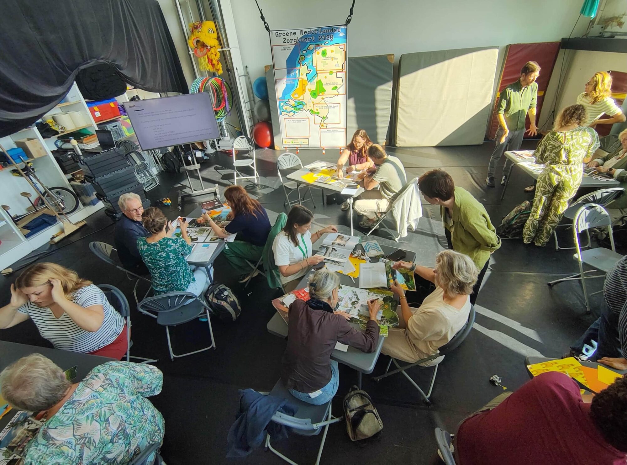
Early 2025, I joined the Regenerate team as a design lead to help run the second season.

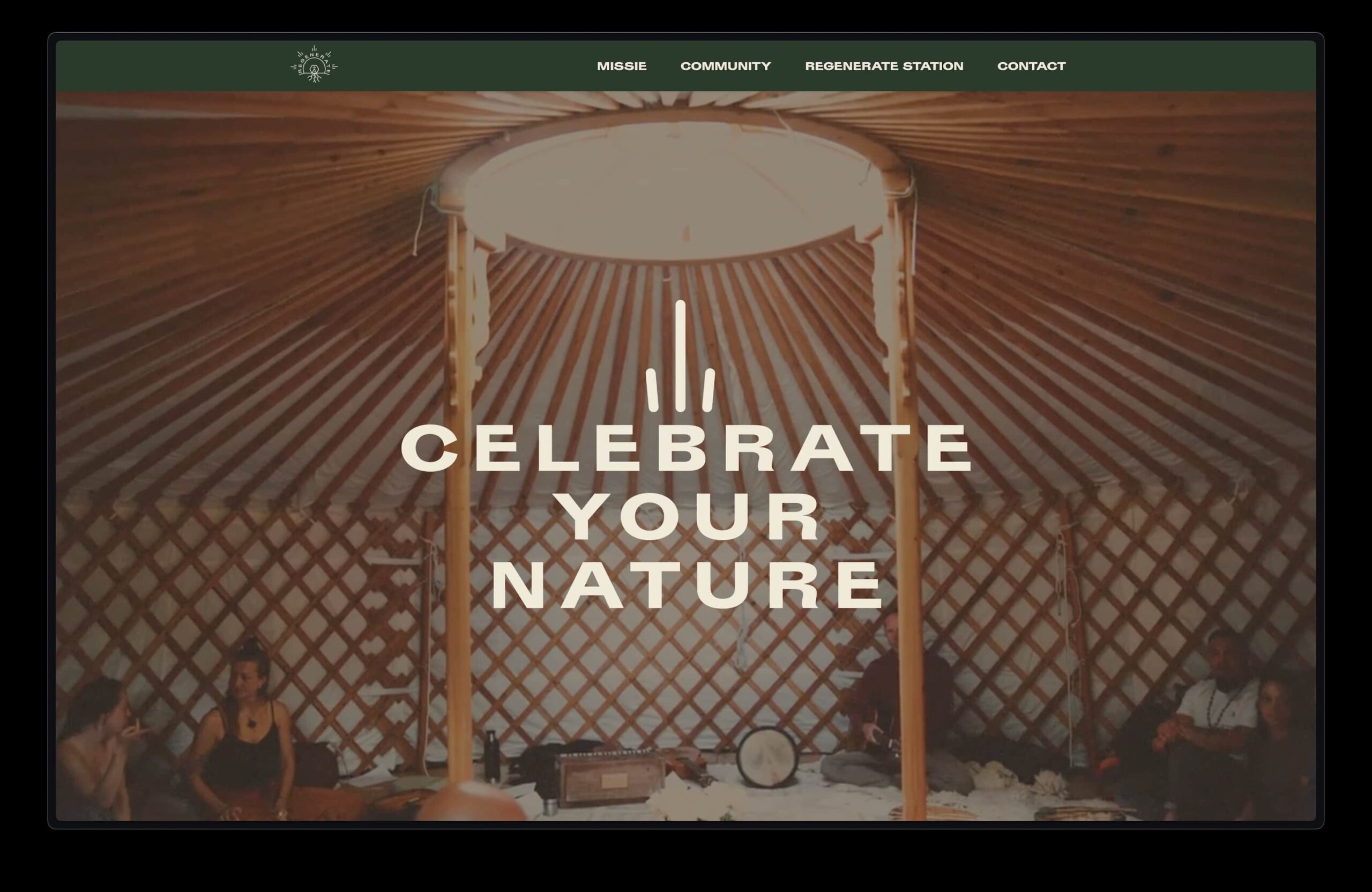
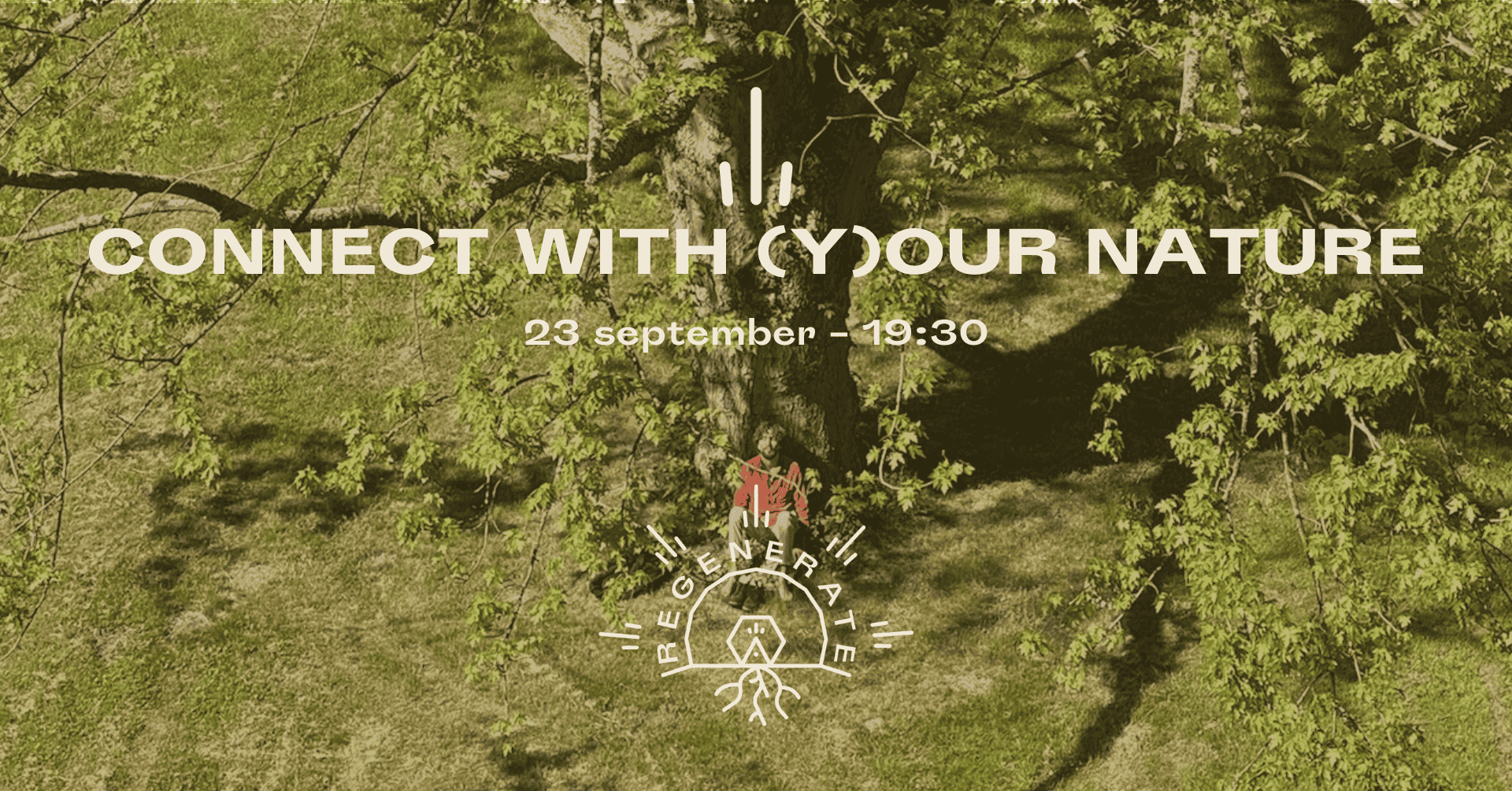
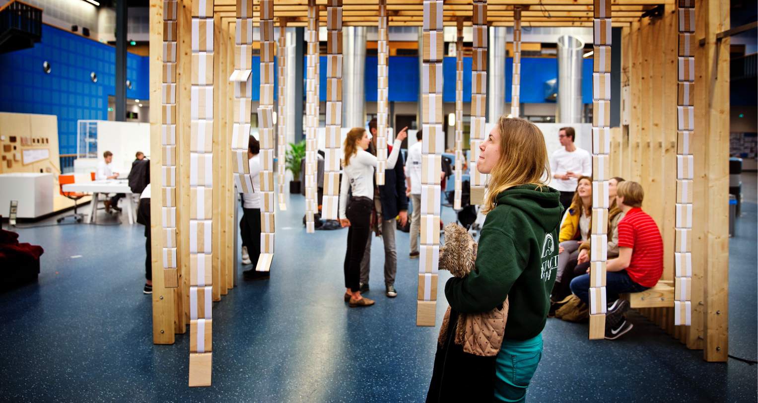
Regenerate is an amazing community (located in the middle of nature at Buitenleeft) that is all about true connection, through dance, music, singing, silence and more.
Together with the team we explored and clarified the vision behind Regenerate and based on this created a new brand identity, including 3 pillars.
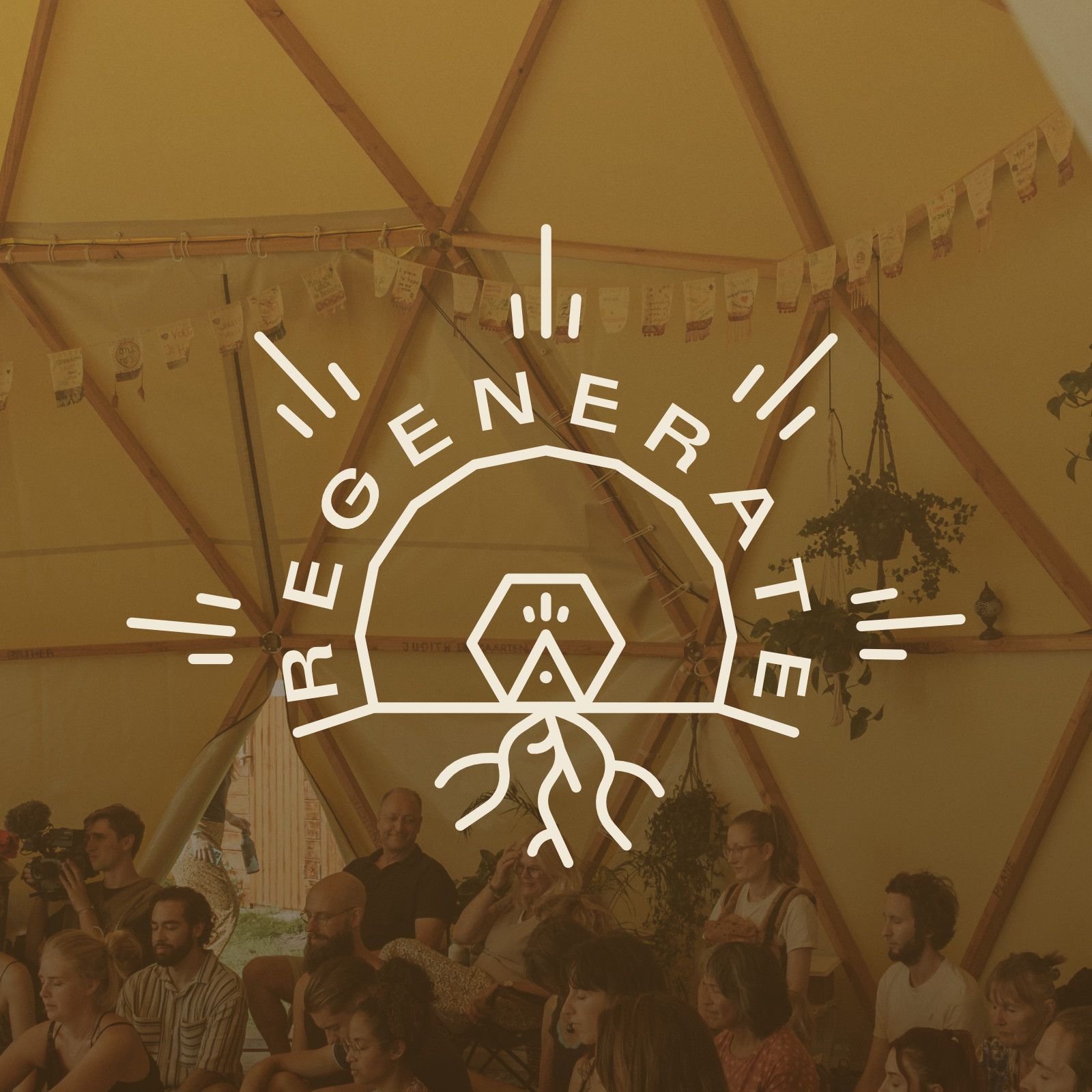
𝗥𝗲𝗴𝗲𝗻𝗲𝗿𝗮𝘁𝗲 – 𝗖𝗲𝗹𝗲𝗯𝗿𝗮𝘁𝗲 𝗬𝗼𝘂𝗿 𝗡𝗮𝘁𝘂𝗿𝗲
From the logo to the icons, the pillars, and the overall brand style, every element was shaped through a conscious, collaborative process.
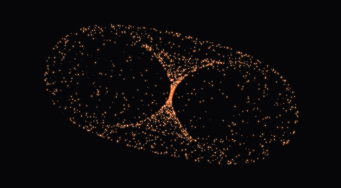
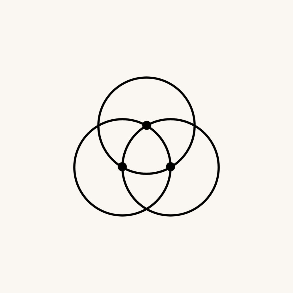
At the center of it all stands the dome, the main gathering place of Regenerate
It represents the first pillar: Modern Tribe: a space where individuals come together to co-create connection, community, and shared experience.
Inside the dome you’ll find a triangle, a subtle reference to the earlier logos and the geometric shapes that build the dome itself. It symbolizes each individual. Alone, a triangle. Together, a structured dome. A thriving community.
Beneath it all, roots stretch into the earth, grounding the symbol in Regenerate’s second pillar: Grounded Presence. A reminder to stay connected to ourselves, to nature, and to the present moment.
Radiating outward, rays of light express the third pillar: Authentic Expression. They represent sharing your truth and your creative energy with the world. Together, these rays turn the dome into a generator of positive energy.
Even the colors tell a story:
* Dark green for nature and growth
* Brown for roots and grounding
* Yellow for light, expression, and regeneration
Every line, color, and form reflects what Regenerate stands for. It’s a perfect example of what I call Conscious Design: creation from a vision, with soul and intention.